In data science, visualization is very important. It allows us to see the data more clearly and makes it fun to examine the data. If you are working on a project and need to turn your work into a presentation and explain it, using visualization can be a lifesaver. Because most of the time, the codes you write will not be equally descriptive and understandable for everyone. This is where visualization comes into play. I will show you different ways of visualization with a supermarket data set.
First thing first, we have to read the data and apply “EDA” so that we can see if there is an empty data or column with an object, etc.

Now we are doing “Exploratory the Data (EDA)”. Those who want to get more detailed information about“EDA” can read my previous story. It will be a great help for your understanding.
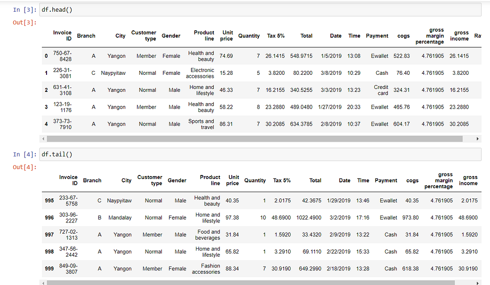
We see examples from the beginning and end of the data.
We see 10 random sample rows from the data.

The data consists of 1000 rows and 17 columns. There are 7 floats, 1 integer, and 9 object columns.

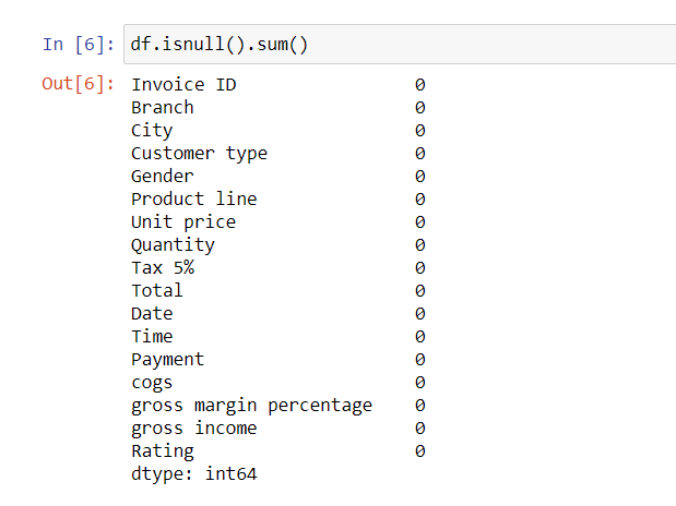
There is no null data in the data.
This supermarket is located in the cities of Yangon, Naypyitaw and Mandalay. And it has 3 branches as A, B, and C. In other words, there is only one branch in each of these three cities.

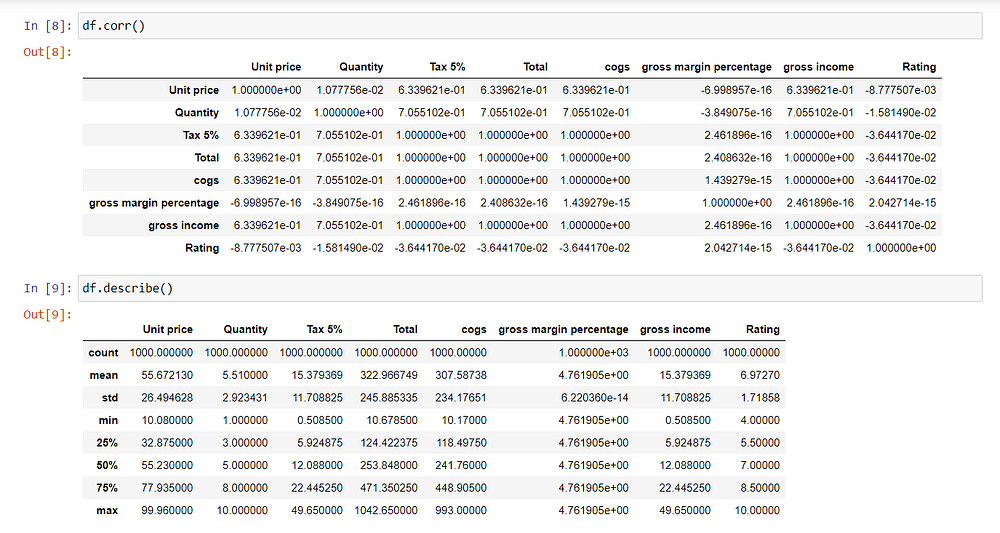
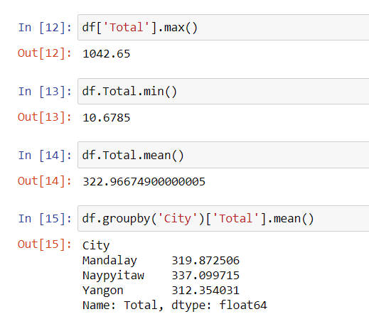
We see the max, min, and average sales amount in the data. At the same time, we can group the sales amount according to the cities.
The highest amount of sales was made in the city of Naypyitaw.
The column was taken as text due to signs such as “/” in the “Date” column. We need to turn this column into time. We do this with DateTime. After turning it into date, we will create day, month, year and hour columns with feature engineering.
- “dt. day”, “ dt. month”, “dt. year”: Finds the number of days, months, and years.
- “dt.day_name ()”, “ dt.month_name ()”: Finds the names of which day and month.

Countplot counts how many sales have been made. Most of the shopping was done in January.

In this graph, we see the distribution of sales by hours. The most sales are made at 07.00 pm.

501 of the purchases were made by women and 499 by men. With a slight difference seen in the chart, women made more purchases.

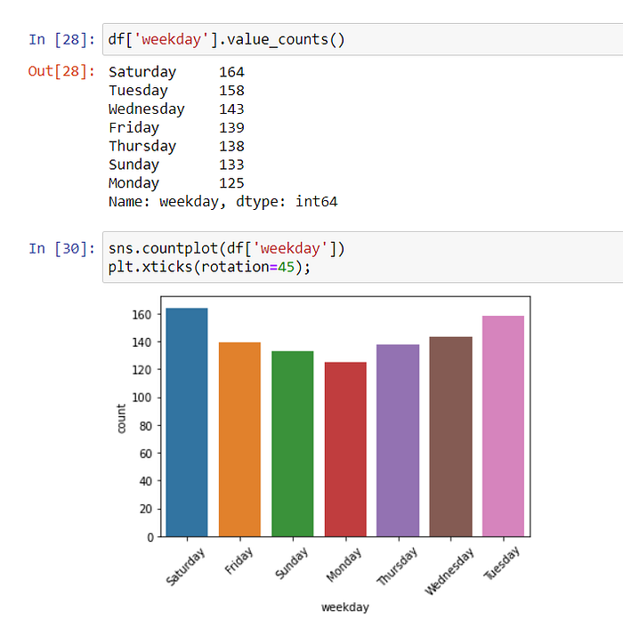
We see the distribution of the sales made by the days of the week below. Most sales were made on Saturday and Tuesday.
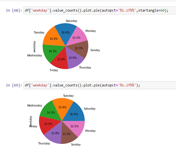
With Piechart, we can also see the percentages of the distribution of sales by days.
explode = (0.1,0.1,0.1,0.1,0.1,0.1,0.1), we can separate the slices from each other. We must write a value for each slice. Since the values are all 0.1, the slices are equidistant from each other.

If you don’t use explode, the slices will stick together. You also adjust the starting degree of the largest data by manipulating the stranger angle.
Among the total sales made in 3 cities, the most “Fashion accessories” products were sold.

With hue, we give the chart one more dimension. In these two graphs, we see the distribution of sales by category for each city and branch.
In Yangon City — Branch A, “Home and lifestyle” products were sold the most. In Naypyitaw city-C branch, mostly “Food and beverages” products were sold. “Sports and travel” and “Fashion accessories” products were mostly sold in Mandalay city-B branch.


On Saturdays and Tuesdays, when sales are most intense, sales were made at 11.00 am, 12.00 am , and 07.00 pm .

We look at the distribution of sales based on customer type. Only at branch C, customers who are members make more purchases. In other branches, normal customers do more shopping.

Gross income is highest in the “Home and lifestyle” category.

In this graph, we see the distribution of customers’ payment methods. With a very small difference, the payment was made more with an e-wallet.

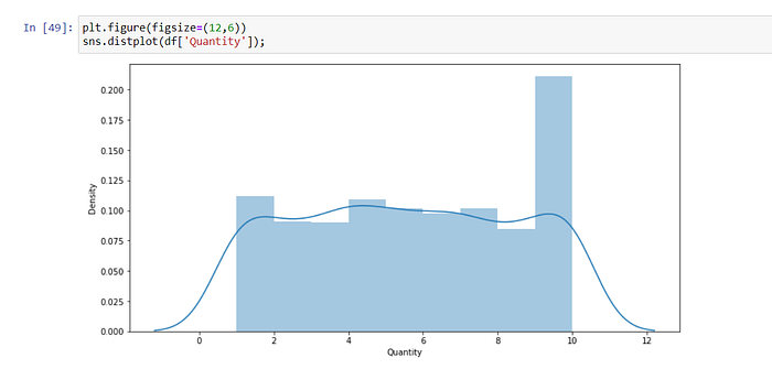
Quantity refers to the number of times taken from one product at a time.
Rating refers to the vote given by customers for the product.

This was my supermarket visualization work. You can find my codes on my GitHub address. Goodbye until my next post. I wish you a nice day.
